I’m trying to make 4 ‘blocks’ each containing 3 modules: heading, text and button. I want these 3 to be aligned horizontally, but don’t know how to do it. I wanted to add screenshots, but being a new user, I’m only allowed to add 1 image… I’ll try to explain in words…
If I put each module in a separate row, they align wonderfully, but appear in the wrong order on a mobile device this leads to the wrong order (going from left to right one column at the time). To get the order right on a mobile device, I need to put the 3 modules in 1 column, but in that case, the text and buttons don’t align (because of different size content).
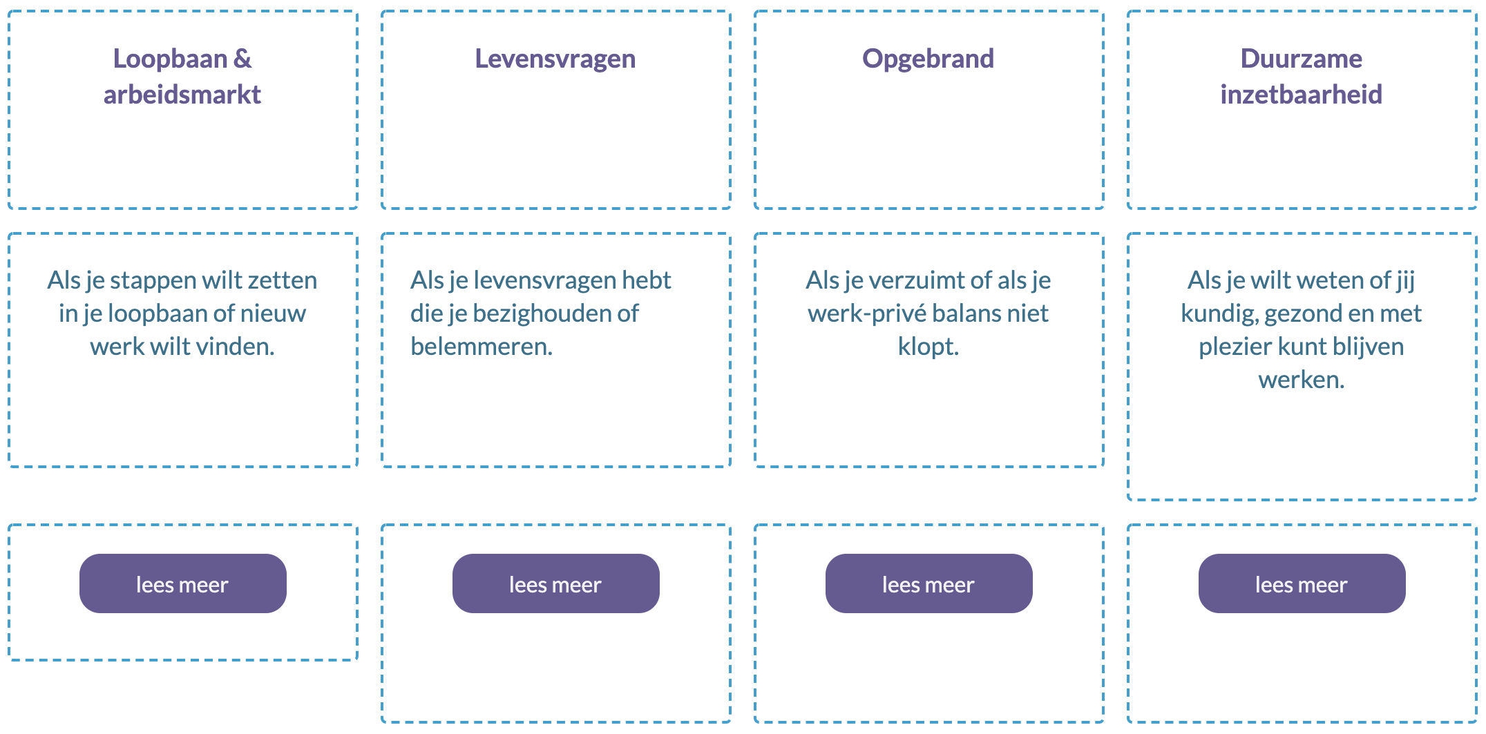
Is there a way to do this, that is right for both big and small screens? Or do I have to make 2 versions of these blocks (1 for big screen, 1 for mobile)
PS I’m quite new to WordPress, BeaverBuilder and this forum, so please be nice to me… 