Hi all,
I’m editing the responsive versions of a new site I’m building - but I can’t get two columns to a row… and I’m struggling to make the site look good.
I read a guide that says head to the Style tab in column settings and you can set the width, however, this option is not available to me.
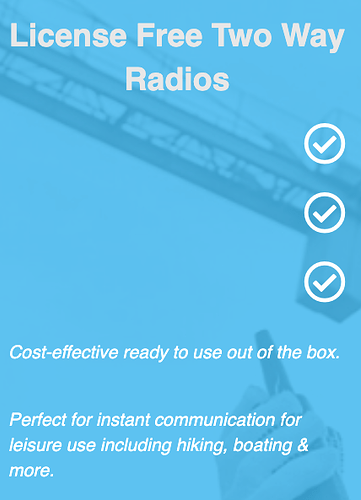
It’s currently on localhost so I can’t send a link, but I’ve attached a pic with how it looks on the small devices. Ideally I’d like the ticks in line, or an option to put them above without them moving on other devices.
My header area also looks an abomination on mobile too but I can’t attack more than one photo
