Hello,
Related Products section of website when viewed on mobile device, appears as one single column (very narrow) aligned to the right.
Website link thehomefurniture-store.co.uk - can you help with the code?
Hello,
Related Products section of website when viewed on mobile device, appears as one single column (very narrow) aligned to the right.
Website link thehomefurniture-store.co.uk - can you help with the code?
Hi Sitehaus,
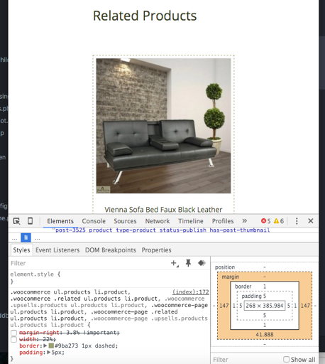
This appears to be related to custom CSS that you may have added.
.woocommerce ul.products li.product,
.woocommerce .related ul.products li.product,
.woocommerce .upsells.products ul.products li.product,
.woocommerce-page ul.products li.product,
.woocommerce-page .related ul.products li.product,
.woocommerce-page .upsells.products ul.products li.product {
    margin-right: 3.8% !important;
    width: 22%;
    border: #9ba273 1px dashed;
    padding: 5px;
}
When I disable this code, the related products display as intended.
To resolve the issue, you’re going to want to wrap that code in a media query and change the margin-right and width values to most likely auto for margin-right and 100% for width.
Thanks,
Danny
That’s being sorted and working as expected. Thanks for your help Danny.
Hi Sitehaus,
No problem, happy to hear your issue has been resolved.
Thanks,
Danny