I Am having trouble with the responsive side of the website below. It is generally behaving well except for one section on the home page is discarding the call out images om a specific mobile size. The specific device is the galaxy tab 3.
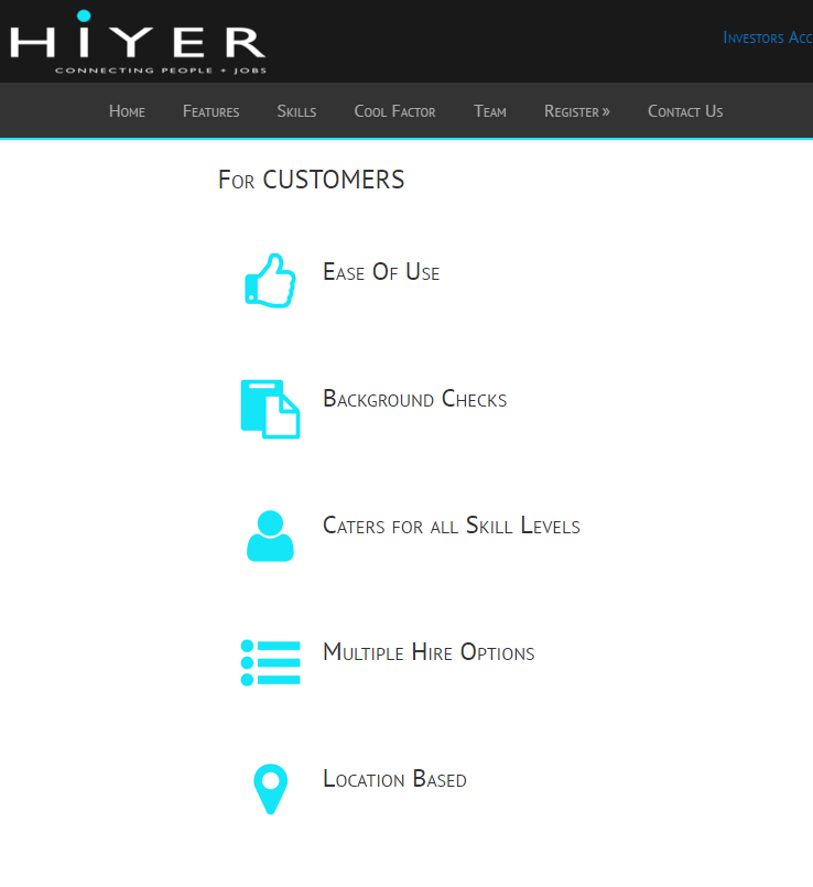
The site is hiyer.org and the section is “Cool stuff” There are a serious of callouts with images that are supposed to be either left or right aligned with the title depending on the section they fall under. All is working well except for on screen size of 755 px to 822 px Where the images disappear. I managed to recreate this situation by using Firebug in firefox. and can supply screen print is you would need it.
It is only in that very small window sizes that it is eratic.
I will supply you with login information below in pm.
I can’t seem to reproduce the problem. I tested the site on 755x822 resolution and I’m able to see all the callout images under The Cool Factor section, I’m assuming this is what you mean as I can’t find Cool Stuff, as seen in the screenshot below.
I am attaching a screen shot from Firefox that show the problem I am having. Maybe that will Show bit better and the problem is not on 755x822px but between a width of 755px to a width of 822PX