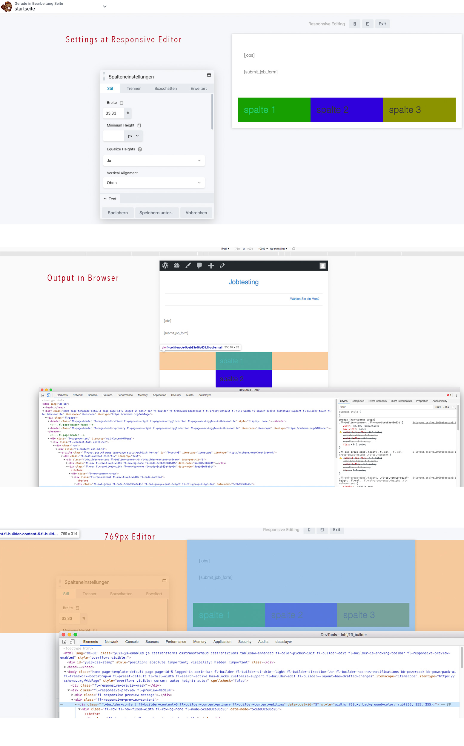
When you’re in BB, go to the top left where it says “currently editing page” and click the down arrow to get Tools, then go to Global Settings. Scroll down a little and you can change the breakpoints for Mobile and Tablet.
They’re a little funny on the exact pixel - I have a hard time remembering if Tablet breakpoint goes up until that px width, or that’s where it breaks to Desktop.
Use Responsive view in Dev Tools to go to that exact pixel width and see where it’s actually breaking and what CSS is effecting the columns.
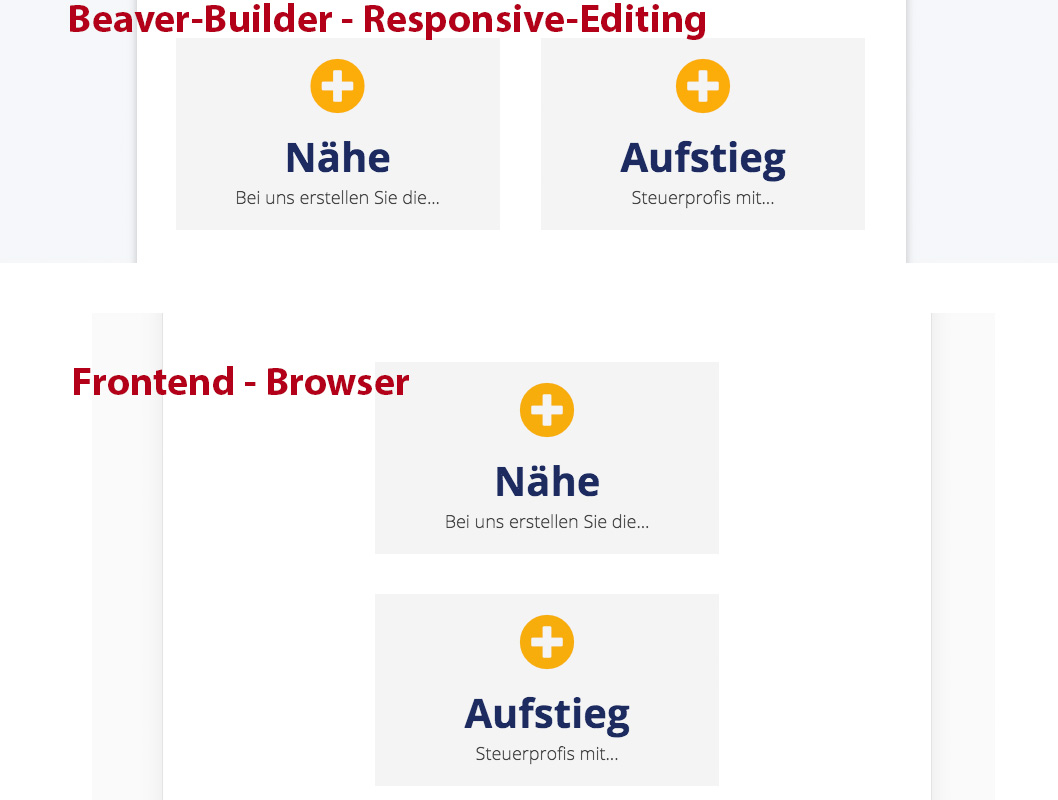
My Problem is, BeaverBuilder adds some css to Frontend by default which is used at small devices.
In my Chrome-Dev-Tools it´s shown like defined but in Responsive Editor in BB it´s wrong because the editor is 1px larger than the defined breakpoint.
and why is BB saying you are only allowed to have 1 column below small breakpoint
i know, i can overwrite the css in my own styles. but how can i modify the editor working right?
if i set breakpoint to 768px the editor should have a width of 768px and not 769px to use css media queries correct
From the looks of your screenshot, it looks like you haven’t changed the widths of the columns in the column settings so that they don’t stack? By default, columns stack for small devices unless you change the widths for the different device sizes.
The max-width: 400px only get used when the column has no width set. I am also not able to replicate your issue what I see in the responsive builder is what I see on my mobile devices.
Therefore, can you provide a link to the site in question? If you prefer not to share the URL, can you send us a ticket.
i think we found the problem. we had 768px for small and 992px for medium devices as breakpoints in global settings. after we set medium to 768 and small to 414 it looks in backend like in browser.