Centering Custom Query Content in Advanced Post Modules

Note: This is my first post to this forum, so please forgive me if it could be written better or if more or less details should’ve been provided. Since it is a BB specific question, I am hoping the moderators will be able to understand my issue, but I can share the link to my site privately if needed.


I am using an advanced post module to display products. I have it setup to display 3 columns on large devices, 2 on medium devices, and 1 on small devices. I am using a custom layout and custom CSS.


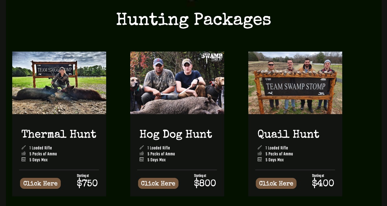
This is what my current results are:


I want the columns centered with 25px between them. I notice that the class .uabb-blog-post-col-3 has floats and absolute positioning. I tried overwriting those with relative position and switching to flexbox. I was able to get everything looking correct on a large screen, but it was broken on medium and small screens (the module had a ridiculous height, like 66,000px or something like that).

I only seem to have these issues because I am using a custom layout in the Advanced Post Module. When I use the default layout, the styles provided within the BB editor work as expected. I need a custom layout though, and that’s where it starts to get stupid.

Overall, my question is this:
What is my best option for centering these columns and setting a 25px space between them?


Here is my custom layout code within the Advanced Post Module:
<section class="packages-container">
    <section class="packages-inner-top">
        [wpbb post:featured_image size='large' display='tag' align='default' linked='no']
    </section>
    
    <section class="packages-inner-middle">
        <h3 class="packages-title">
            [wpbb post:title]
        </h3>
        
        <p class="packages-includes guns">
            [wpbb post:acf type='text' name='guns']
        </p>
        <p class="packages-includes ammo">
            [wpbb post:acf type='text' name='ammo']
        </p>
        <p class="packages-includes days">
            [wpbb post:acf type='text' name='days']
        </p>
    </section>
    
    <hr>
    
    <section class="packages-inner-bottom">
        <a href="#" class="packages-button">Click Here</a>
        <p class="packages-price">$[wpbb post:acf type='number' name='base_price']</p>
    </section>
</section>


And Here are my styles:

.hunting-packages .uabb-blog-post-content {
	background: var(--tss-black);
	padding: 0 0 10px !important;
	width: 300px;
}

.packages-container {
	background: var(--tss-black);
}

.packages-inner-top {
	max-width: 300px;
	max-height: 200px;
}

.packages-inner-middle {
	margin-top: 50px;
	text-align: left;
	padding-left: 30px;
}

.packages-title {
	margin-bottom: 15px !important;
	font-size: 35px;
}

.packages-includes {
	font-weight: lighter;
	font-size: 16px;
	letter-spacing: 1px;
	margin: 0;
}

.packages-includes:before {
	content: '';
	display: inline-block;
	width: 13px;
	height: 13px;
	margin-right: 10px;
}

.guns:before {
	background: url('https://smple.review/tss/wp-content/uploads/2023/08/rifle.png');
}

.ammo:before {
	background: url('https://smple.review/tss/wp-content/uploads/2023/08/ammo.png');
}

.days:before {
	background: url('https://smple.review/tss/wp-content/uploads/2023/08/map.png');
}

.hunting-packages hr {
	width: 85%;
	border-top: 3px solid var(--tss-gray) !important;
	margin-bottom: 10px;
}

.packages-inner-bottom {
	display: flex;
	justify-content: space-around;
	align-items: center;
}

.packages-button {
	background: var(--tss-brown);
	padding: 10px 10px;
	height: 35px;
	border-radius: 13px;
	font-family: "Special Elite";
	line-height: 1;
}

.packages-price:before {
	content: 'Starting at';
	font-family: "Teko";
	font-weight: lighter;
	display: block;
	font-size: 14px;
}

.packages-price {
	text-align: left;
	font-family: "Special Elite";
	font-size: 30px;
}

I believe I have gotten it to a point where I like it, but the code it required seems unintuitive. I am still open to any instruction regarding this issue if someone feels like sharing. I feel like this shouldn’t be so complicated. I am fairly new to Beaver Builder, so odds are I am just missing something.

I didn’t change my HTML structure at all, but here is my updated CSS:

/* HUNTING PACKAGES */
.hunting-packages .uabb-module-content {
	display: flex;
	justify-content: flex-start;
	flex-wrap: wrap;
	max-width: 984px;
	margin: 0 auto;
}

/* I had to explicitly get rid of floats, absolute positioning, left/top styles and width.
   There is a function in one of the uabb JS files that is using some calculation to set the width,
   and that was messing with my styles. */
.hunting-packages .uabb-blog-posts-col-3 {
	float: none !important;
	position: relative !important;
	left: auto !important;
	top: auto !important;
	width: auto !important;
	height: 455px !important;
}

/* All of my posts are contained in  sibling divs which are contained in .uabb-module-content. 
  I'm sure it has something to do with the BB styler, but there is another div after my last post div called
  .uabb-post-grid-sizer. This was throwing off my flexbox styles, so I had to hide it. */
.hunting-packages .uabb-post-grid-sizer {
	display: none !important;
}

.hunting-packages .uabb-blog-post-content {
	background: var(--tss-dark-gray);
	padding: 0 !important;
	width: 300px;
	max-width: 300px;
	height: 455px;
	max-height: 455px;
}

.packages-inner-middle {
	text-align: left;
	padding-left: 30px;
}

.packages-title {
	margin-top: 50px !important;
	margin-bottom: 15px !important;
	font-size: 35px;
}

.packages-includes {
	font-weight: lighter;
	font-size: 16px;
	letter-spacing: 1px;
	margin: 0;
}

.packages-includes:before {
	content: '';
	display: inline-block;
	width: 13px;
	height: 13px;
	margin-right: 10px;
}

.guns:before {
	background: url('https://smple.review/tss/wp-content/uploads/2023/08/rifle.png');
}

.ammo:before {
	background: url('https://smple.review/tss/wp-content/uploads/2023/08/ammo.png');
}

.days:before {
	background: url('https://smple.review/tss/wp-content/uploads/2023/08/map.png');
}

.hunting-packages hr {
	width: 85%;
	border-top: 3px solid var(--tss-light-gray) !important;
	margin-bottom: 10px;
}

.packages-inner-bottom {
	display: flex;
	justify-content: space-around;
	align-items: center;
}

.packages-button {
	background: var(--tss-brown);
	padding: 10px 10px;
	height: 35px;
	border-radius: 13px;
	font-family: "Special Elite";
	line-height: 1;
}

.packages-price:before {
	content: 'Starting at';
	font-family: "Teko";
	font-weight: lighter;
	display: block;
	font-size: 14px;
}

.packages-price {
	text-align: left;
	font-family: "Special Elite";
	font-size: 30px;
}


/* I had to set a specific width for the uabb-module-content div in order to get everything properly
centered with flexbox. Because of that, I had to include these @media queries do decrease the
max-width for various break points. */
@media only screen and (max-width: 1078px) {
	.hunting-packages .uabb-module-content {
		max-width: 656px !important;
	}
	
	.hunting-packages .uabb-blog-posts-col-3 {
		margin-bottom: 50px !important;
	}
}

@media only screen and (max-width: 710px) {
	.hunting-packages .uabb-module-content {
		max-width: 328px !important;
	}
	
	.packages-title {
		margin-top: 20px !important;
	}
}