Hey Everyone,
I have gone through other topics similar to this but haven’t found anything that works.
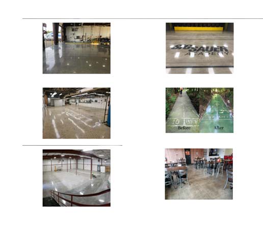
The website is Testing Page on Website
At the top are 8 photos, which I when in mobile I would like to be stacked 2 wide, and 3 down. I have tried setting up 2 different sections one for large/mobile devices and then another that is visable only for mobile/small. However, it’s always stacked 1 photo at a time.
Thanks for the help.