At the top are 8 photos, which I when in mobile I would like to be stacked 2 wide, and 3 down. I have tried setting up 2 different sections one for large/mobile devices and then another that is visable only for mobile/small. However, it’s always stacked 1 photo at a time.
Not sure what you mean by 2 wide and 3 wide as I only see 6 images. However, if you don’t want your Photo modules to stack on medium and small devices. You can set the column widths for medium and small devices to 33.33% for each column which will force your images into three columns. For two columns, set the column widths to 50%.
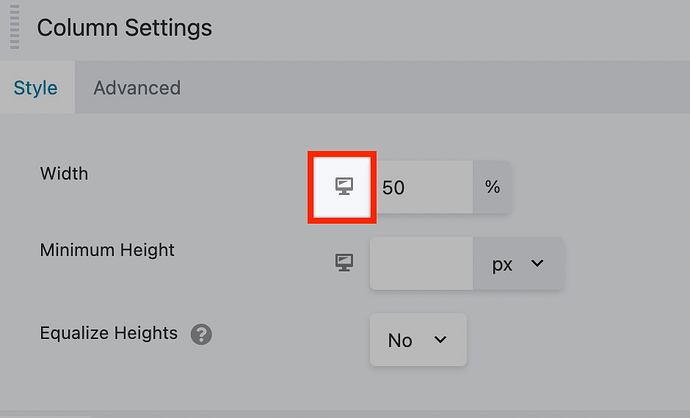
To set the column widths for medium and small devices simply click the device icon next to the column widths. When you click this, it will change from a large device to a medium, clicking again will switch it to small devices. This allows you to set the column widths on a per device basis.