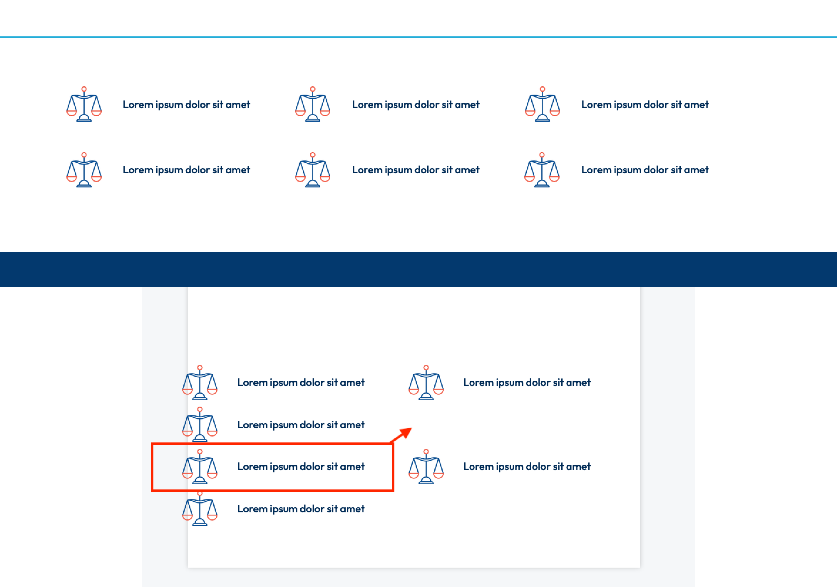
My issue:
I have a row layout that consists of 2 rows of 3 columns each. Here is what it looks like on desktop sizes (see 1st image). If I want this behavior to change on tablet devices to 3 rows of 2 columns each (50% width), the following problem occurs (see 2nd image). The first column of the next row does not wrap or follow up the column in the previous row. How can I get this column to wrap into the proper row.