I’m not happy with the default media queries for multi-column layouts. And while I could use css to try and overcome this, I don’t think I should have to. Nor do I want to try and deal will overriding / or having to add a lot of extra code to overcome that.
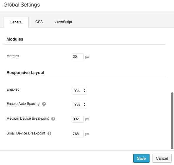
If you load up the page builder and then click the Tools > Global Settings. In the settings window, you can change the responsive breakpoints for medium and small devices.
If this isn’t to your liking, you will need to override them manually, unfortunately.