Custom Menu Formatting - Borders around Menu boxes

I would like build menu links with white borders exactly like those found for the menu at the top of the page of puremaintenance.com

Here is the website I am creating for one of their licensees using beaver builder: puremaintenancenebraska.com

Here are the specific challenges:

  • when I replace right with left in the following CSS, it works with the word “right” but won’t put any border in place for “left”… .my-menu ul li { border-right: solid #ffffff; }
  • The borders are not fixed to the column height whatever it may be. You can see a gap in the vertical border between the logo and the menu
  • And lastly The other challenge is could be what happens to these borders when shrinking the width of the browser.

Thank you for your help

Hi John,

You could try the CSS below and see if this helps. :slight_smile:

@media screen and (min-width: 768px) {
  header.fl-builder-content .fl-module-menu .fl-menu .menu {
    display: flex;
  }
  header.fl-builder-content .fl-module-menu .fl-menu li {
    border: 3px solid white;
  }
  header.fl-builder-content .fl-module-menu .fl-menu li a {
    display: flex;
    width: 100%;
    align-items: center;
    font-size: 90%;
  }
}

Hi Danny, Yes it helped, thank you!

Is there a way to make it so the border applies only to the left side of each menu selection instead of around the entire selection? This one change would fix 4 of the 5 things I still would like to solve for.

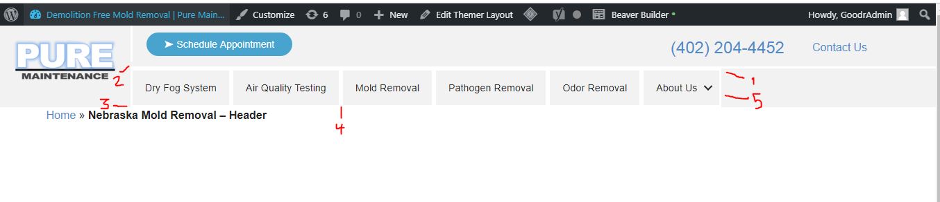
the only issue I would have left is #2 in the screenshot.

1 - double wide on top - woud like it to be just a single line that goes all the way to the right side of the page

2- gap which confuses me because the margins on top and on bottom are all set to zero. Can you help me figure out what is causing this gap?

3 - woud like to delete single line on bottom

4- double wide in center - because left a right are applying

5- the last line on the right - would like this deleted

Thank you so much for your help!

Danny - any thoughts on how to use CSS to correct the 5 items I mentioned?

Hi John,

If you replace the CSS I gave you previously with the CSS below this should resolve most of the issues. :slight_smile:

@media screen and (min-width: 768px) {
  header.fl-builder-content .fl-module-menu .fl-menu .menu {
    display: flex;
  }
  header.fl-builder-content .fl-module-menu .fl-menu li:first-of-type {
    border-left: 3px solid white;
  }
  header.fl-builder-content .fl-module-menu .fl-menu li:last-of-type {
    border-right: 0;
  }
  header.fl-builder-content .fl-module-menu .fl-menu li {
    border-right: 3px solid white;
  }
  header.fl-builder-content .fl-module-menu .fl-menu li a {
    display: flex;
    width: 100%;
    align-items: center;
    font-size: 90%;
  }
}
  1. The gap here is caused by a border you have added to the column which has the “Schedule Appointment” button. If you remove the border it will close the gap. :slight_smile:

  2. If I understand correctly, then the space here is caused by your “PURE” logo image. You will want to reduce the width in the Photo module settings which will reduce the height and remove the gap. :slight_smile:

  3. Resolved with the CSS above.

  4. Resolved with the CSS above.

This resolved everything as it relates to the menu. Only issue left is #2, let me play around with that a little more to see if I can fix that.

Thank you!

The only other I needed to do is to all modules to align vertically in the center. Took care of the border space

Hi John,

Which modules do you want vertically aligned?