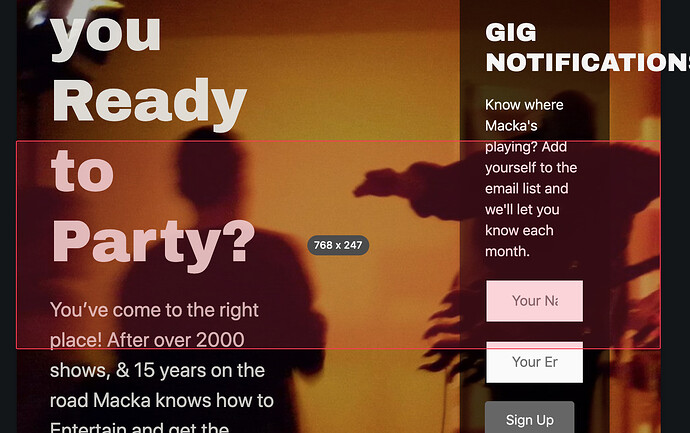
I’ve changed the medium breakpoint to 1027 but when I engage responsive mode it still shows the old setting. I’ve cleared all caches including BB’s, put my Cloudflare account into dev mode and it’s still showing the old medium breakpoints. www.macka.com.au
Just to clarify, you changed it from 1024 to 1027? And what exactly do you mean by “engage responsive mode it still shows the old setting”?
Sorry that’s my mistake and thanks for responding. I should have written 1024 and engaging responsive mode was just my way of saying, I turned it on. Maybe it’s best if I tell you want I’m trying to do. When viewing on an iPad Air 2, which is 1024 screen res the site needed to be adjusted, so I thought I would change the global settings to 1024 for medium device break points, so I can start designing in responsive mode for that size as the medium size. As you can see from the attached the medium breakpoint has not seemed to change. Am I doing something wrong?
I’m not using the BB theme, I’m using Generate Press. Hope this makes sense to you.Just by setting the responsive breakpoints, not a whole lot will change without you going in there and telling it what you want it to do on Medium devices. You have to tell it what you want the font sizes to be in each module, set the column widths, etc.
What things have you changed for MD devices that you aren’t seeing happen?
