Hi, I noticed my client’s site (uses BB theme) wasn’t showing the nav menu on mobile devices. Someone else built the site and I’m doing SEO on it. It was a one page site but I’ve added more pages and also added a navigation menu which appears fine on desktop. I noticed on mobile that NO menu appears. If I go into Beaver Bulider to edit, say, the home page and resize my browser to the breakpoint, I do see the hamburger menu. I don’t know what else I’m supposed to do, but I save and publish everything and still when I view the site on a mobile device there is no mobile nav menu. Can you please help? The site is: airportghostkitchen.com
You have the menu module set to only be visible on the desktop
Hi Pross, Thanks. As I said someone else built the site so I have to figure out how it works. Where would I find the visibility toggle?
Also, right now it looks like I’m having a plugin conflict or something. I go to edit (or even view) a Beaver Themer element and I get an error. I’ll submit a ticket if I can’t solve it, but let me know where that toggle is. Thanks!
If you open the menu module, under advanced options you can set the visibility, currently its set to desktop only, so the mobile side of it is hidden.
Both Themer and Beaver Builder are not up to date, you should make sure everything is up to date, might fix your issue.
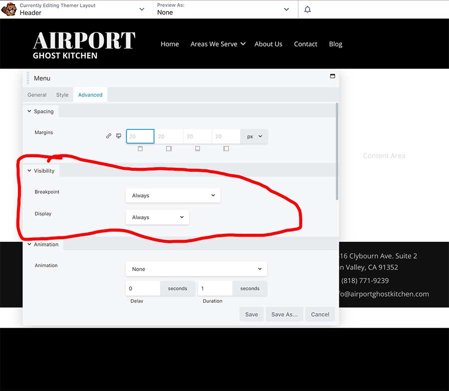
Hi Pross. I’m still not sure about it. I’m attaching a screen shot of my menu module. Under Visibility I’ve got everything set to “Always” just to be sure. Note that if I resize my desktop browser while I’m editing the header/menu, I DO see the hamburger menu. However, after saving everything and publishing, I still DO NOT see it on my iPhone.
BTW, I did upgrade the Beaver Builder plugins too (Godaddy hides the update function in something new called GDCore, but I found it).
Perhaps you should open a ticket, the menu definitly has the desktop only class applied.