As stated in another topic, I am trying to replicate the header that is used on the Beaver Builder site. I want the exact same responsive behaviour, and no logo resizing.
Is there a header template available that I could use?
Hi, it might depends on which type of header you use:
- BB Theme’s header?
- Another theme’s header?
- BB Themer’s header?
If BB Theme, BB’s site seems to use this customizer’s setting:
Header > Header layout > Fixed header: Fade
And their logo is resized on page scroll.
If BB Themer’s header, i think there’s a similar option as in BB Theme, like fixed header and fade effect.
But maybe i missed the point, you mentioned responsive, not on page scroll…
Do you have an URL to share, so the code can be inspected?
I am using BB Themer, and the BB Theme, and I don’t know that there is such a thing as the “BBTheme’s header”?! Yes, I’m not concerned about scrolling, but about responsive resizing.
Here is my site: https://www.ingridlill.dk/
The logo resizes with the browser width. I want it to stay the same size.
Here is an example what I want to achieve: https://geoffkullman.com. The header is full width, and the logo stays the same size.
It is done in Divi, as far as I can see. But BB can surely do the same thing?!
As long as you don’t build a custom header with Themer and assign it to your site’s pages, the theme’s header will be used.
- BB Theme’s header: https://kb.wpbeaverbuilder.com/article/155-customizer-settings-the-header-tab
- BB Themer’s header: https://kb.wpbeaverbuilder.com/article/437-themer-header-layout-type
Now, it looks like you use a Themer’s custom header, right?
[Edit]
On your custom header’s layout, there are 2 columns, 1 for the logo and 1 for the menu.
I would suggest you enlarge a bit the logo column to prevent its content to be reduced when reducing the browser’s window width.
If you want to keep the 2 columns in the same row on medium/narrow screens, you have to set the responsive width to each column to prevent them to be stacked.
https://kb.wpbeaverbuilder.com/article/419-prevent-column-stacking-with-custom-widths
But given your logo is pretty large, maybe you’ll want the logo and menu to stack on narrow screens? If so, don’t set the columns responsive width for narrow screen, only for medium.
Thank you for your answer. I will look into your links.
BUT.
I am not concerned about stacking.
I don’t want my logo to resize. I want the logo size to be the same no matter the browser width.
That’s all.
How do I do that?
The logo file should have the final width.
Currently, it’s much wider.
Then you should enlarge the first column where the logo stands, this will prevent it to be resized as the screen width decrease.
Thank you, this helped a lot. Now it is ok as long as both boxes (logo and menu box) fit into the browser width. When the browser becomes narrower, it resizes.
I would like the boxes to stack at this point.
How do I define the breakpoint exactly there, before the logo resizes? Here is a video with what I mean.
It’s often tricky to precisely stall a logo in a responsive context which is fluid by nature.
On your video, we see that, at some point, there’s not enough horizontal space to contain both the logo and the menu on a single line.
It happens just before the menu turns to hamburger, so i guess it’s before the first breakpoint (medium / 992 px by default in BB theme).
To fix this, you could reduce the logo or the menu width a little bit and adjust their columns consequently.
If you want the logo and the hamburger menu to stay on a single line after the second breakpoint (small / 768 px by default in BB theme), set their columns responsive size, e.g. 80% logo /20% menu.
On very narrow screens like iPhone 320 px, you won’t have a choice, the logo will have to be reduced.
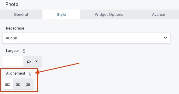
Also, you should set the logo responsive alignment to the left for small devices.
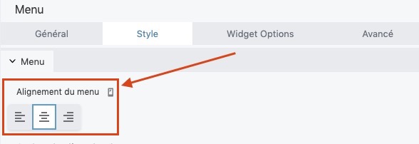
If you want the logo and the menu to stack on narrow screens, let the columns width unset for small devices, and set the menu responsive alignment to center.
But the stacking will happen just past the second breakpoint (768 px), this will let important blank spaces at the left and right of the elements on iPad portrait orientation for instance.
There’s no ideal solution, we have to make concessions with responsive. 
Or diving into custom CSS, which can take time to produce enhancements that are not worth it so much.
More info about BB responsive breakpoints: https://kb.wpbeaverbuilder.com/article/751-about-breakpoints-for-device-sizes
Another solution would be to modify the site’s breakpoints (see link above to BB doc) but it would affect the site globally, maybe overkill for just the logo(?)
Thank you so much for your help. I have to study all this responsive-behaviour-stuff.
About resizing: I asked support, and they gave me a CSS snippet that assigns a maximal size for the logo.