It’s often tricky to precisely stall a logo in a responsive context which is fluid by nature.
On your video, we see that, at some point, there’s not enough horizontal space to contain both the logo and the menu on a single line.
It happens just before the menu turns to hamburger, so i guess it’s before the first breakpoint (medium / 992 px by default in BB theme).
To fix this, you could reduce the logo or the menu width a little bit and adjust their columns consequently.
If you want the logo and the hamburger menu to stay on a single line after the second breakpoint (small / 768 px by default in BB theme), set their columns responsive size, e.g. 80% logo /20% menu.
On very narrow screens like iPhone 320 px, you won’t have a choice, the logo will have to be reduced.
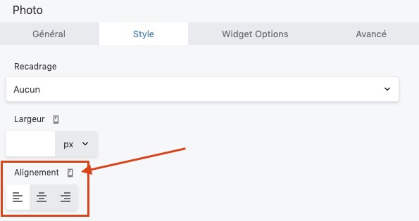
Also, you should set the logo responsive alignment to the left for small devices.
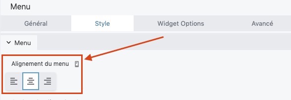
If you want the logo and the menu to stack on narrow screens, let the columns width unset for small devices, and set the menu responsive alignment to center.
But the stacking will happen just past the second breakpoint (768 px), this will let important blank spaces at the left and right of the elements on iPad portrait orientation for instance.
There’s no ideal solution, we have to make concessions with responsive. 
Or diving into custom CSS, which can take time to produce enhancements that are not worth it so much.
More info about BB responsive breakpoints: https://kb.wpbeaverbuilder.com/article/751-about-breakpoints-for-device-sizes