I’m working on this page here: https://icmda.net/resources/webinars-copy/
I’ve got the layout looking how I want it on a full screen, but when going to a smaller device, it doesn’t respond how I’d like it to.
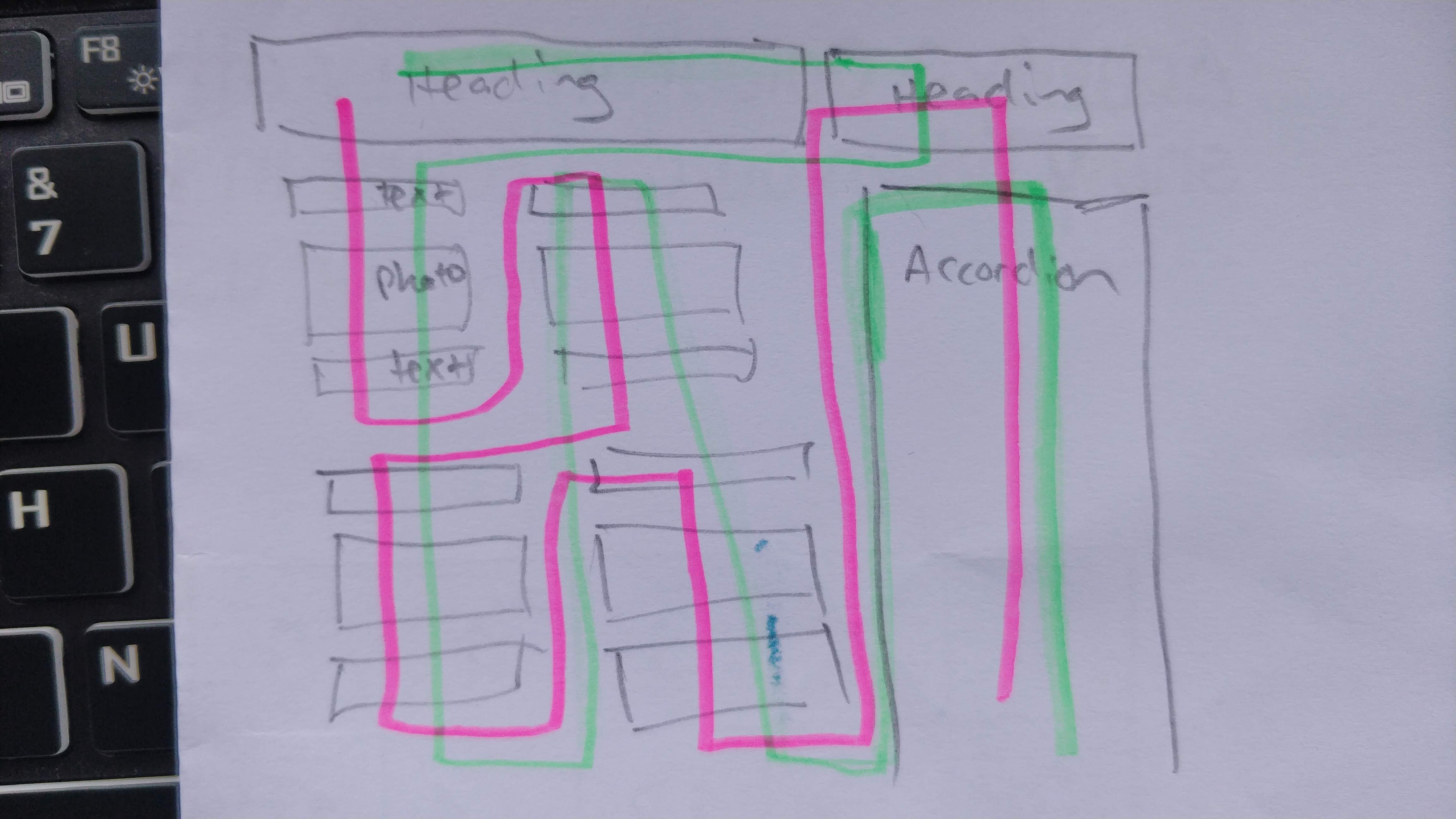
In the image below is what it does (in green) - I’d like it do follow the path in pink.
Can anyone point me to the right way to layout the page - I’ve tried lots of combinations and can’t get it how I want (it’s all in one row).
Many thanks!