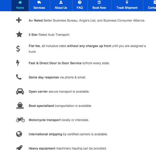
When using the Icon Module, I have it set to left align. However, when it hits a mobile breakpoint, the module becomes center aligned. This makes the icons look messy and not lined up. Also, it would be nice if the icons would have a container so that they take up the same space and the text started at the same position.
[Content Hidden]
Hi MWS,
Can you try this for me, please. Add the CSS code below to either Customizer > Code > CSS Code or to your style.css file via your child theme.
@media screen and (max-width: 768px) {
  .fl-icon-wrap {
    display: block;
  }
}
Then check to see if the icons are wrap to the left.
All the best,
Danny
Hey Danny,
That seemed to do the trick for keeping the icons wrapped left. Is there a way/method to having a container around the icons so that they’re all the same width, effectively having all the text line up and start at the same position?
Hi MWS,
There is no way of adding container wrap around the icons so that they’re the way width, as each icon has a unique width.
However, you could try this CSS snippet:
.fl-node-5623ce66da707 .fl-icon {
    width: 40px;
}
This basically sets all the icons in that container to a width of 40px. The end result is that all text is aligned.
Play about with the width if it is not to your liking.
All the best,
Danny
That workaround will do for now. Thanks for the help.
No problem, happy to help.
Thanks,
Danny