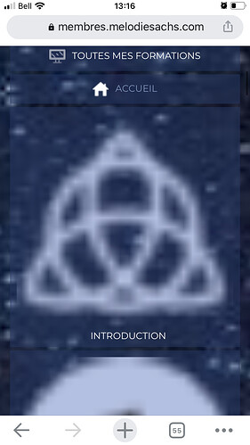
Hi everyone, I’m having some issues with icons on menus in the responsive version : I added the plugin “Menu Image” to be able to add custom icons, it’s great on large screens and works perfectly, but on the responsive version, the size seem to beug.
When someone first click on the hamburger menu on mobile, the icons appears very large, and then if the person close and reopen the hamburger menu, then the 2 first icons appear at the right size but not the others, and at each “close-reopen” 2 more icons appear on the right size.
So I think it might be some “automatic re-size” that is not “automatic” enough and that there is some beug somewhere but I don’t know where and how to correct it so the icons will all appear at the right size right away.
Any insights ?
