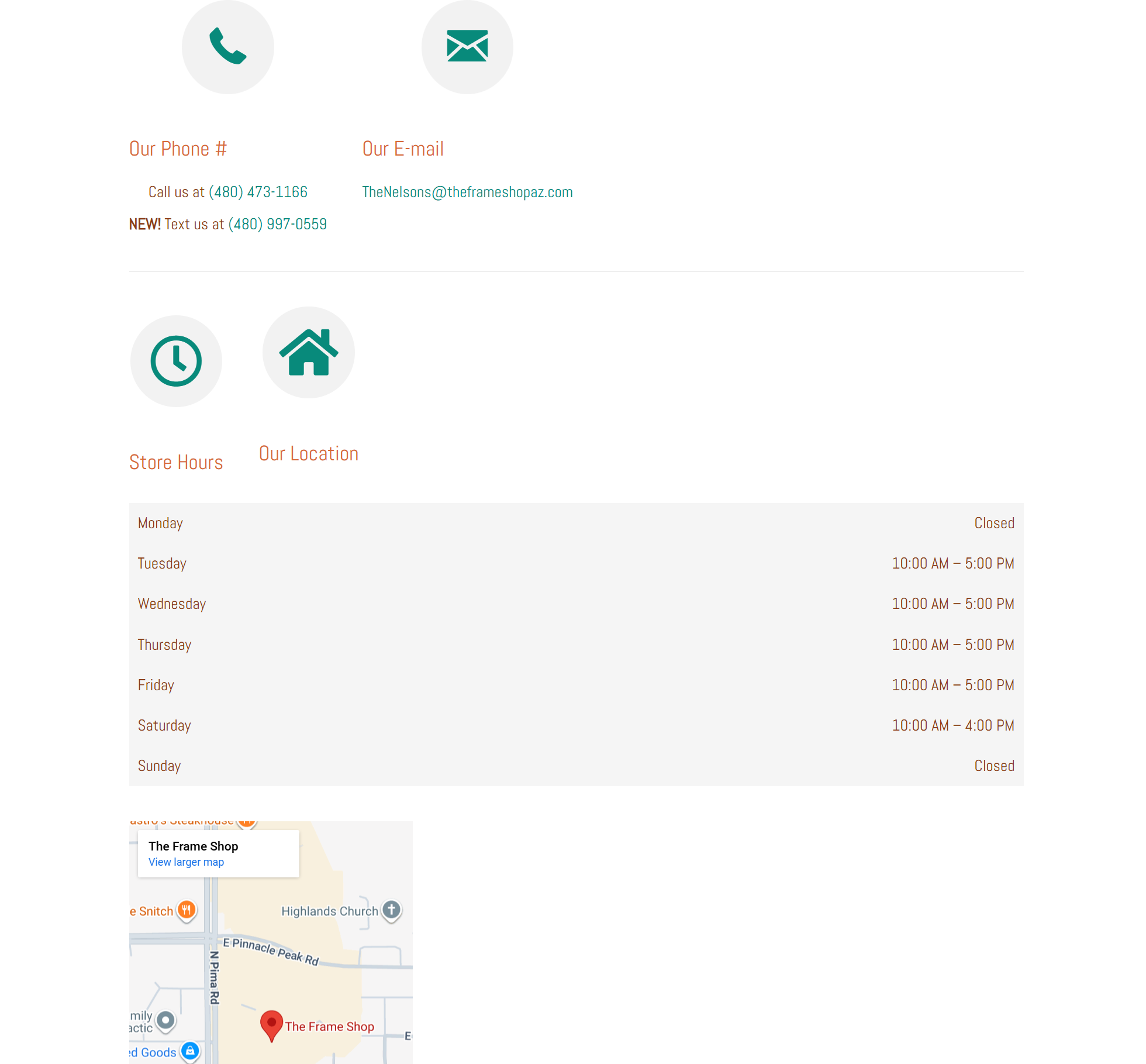
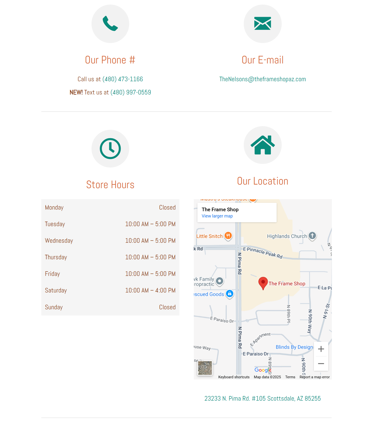
So I am not a web dev, I am just a humble human who worked with web developers a lot when I did Marketing back in the day. My parents asked me to help with their website for their new business, they just got rid of the company who touched all this before. I went in to edit their contact page and made it looks great in the editor (Sorry I am a new user and it only allows one image). But when I publish it…it looks like this instead of in the middle. I will post what it is supposed to look like in a response for more context!
Looks like you got your column widths and the other issues figured out… for the most part.
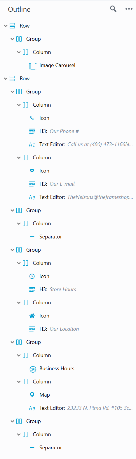
The problem you couldn’t resolve was getting the “our location” above the map. While not an issue given the current layout, the problem is still technically there - your Store Hours heading/icon (and formerly Location too) are in their own group of columns, above the Hours and Maps columns they were introducing. The heading for the store hours just needs dragged down into the column with the Business Hours module. then you can just delete that group of empty columns.
Also with that many images, make sure you set up lazy loading, or better yet, get that slideshow off the homepage and just have a gallery (that lazy loads) on the work portfolio page.