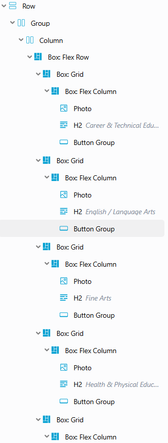
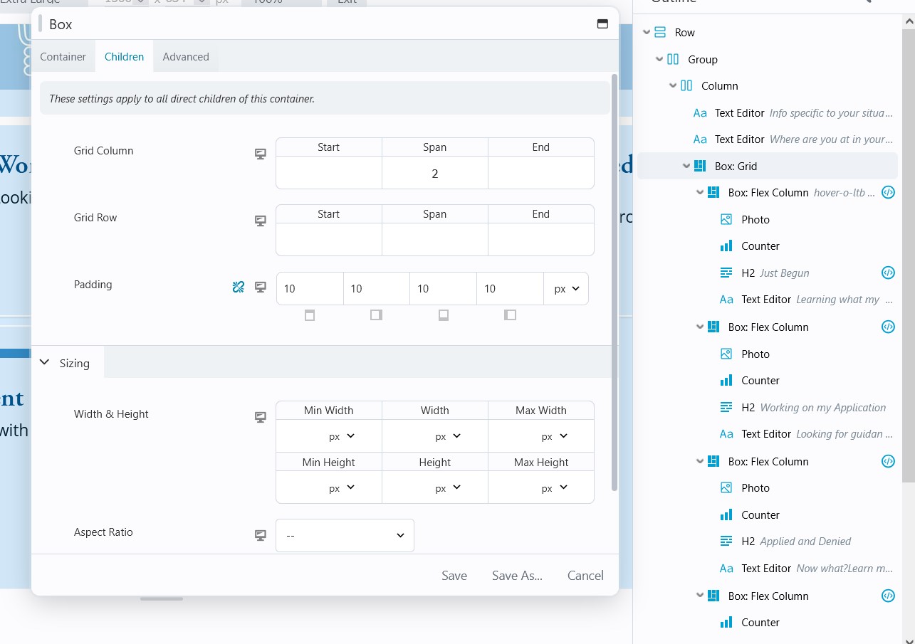
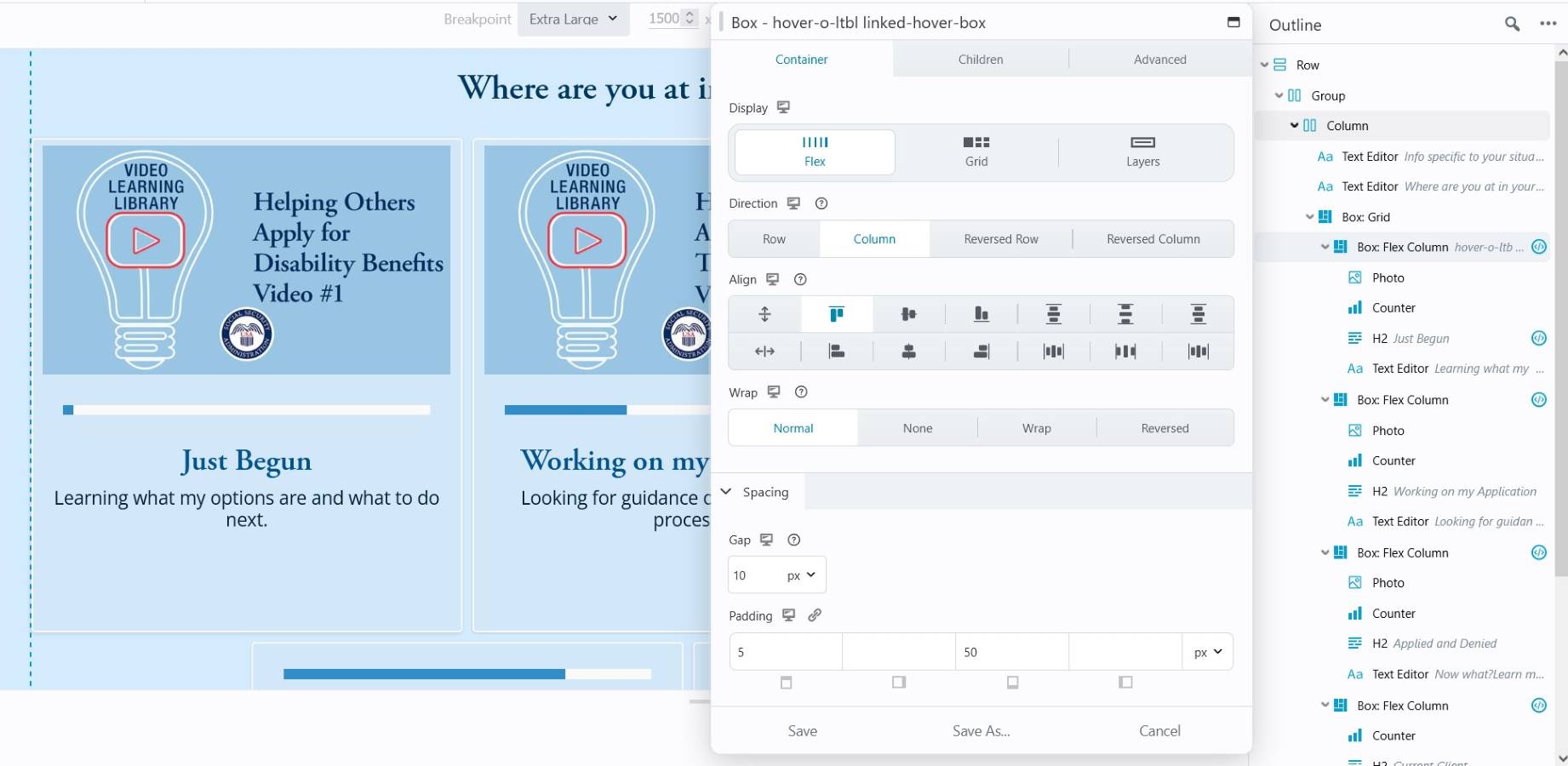
I am trying to set up a multi-layer box module grid that is responsive to screen size. I’ve watched te BeaverBuilder video, but I am struggling to get it to work properly because I think it is causing an overflow that I’m unsure how to fix. So far, I have it set up (possibly in a convoluted way) where it is a box flex row first, then a box grid with 4 columns and 2 rows. After this, I’ve added another box grid for the sizing of the box and then a box flex column to add in a photo, a heading, and a button group (not all columns will have this going forward). I will attach a screenshot, but this repeats for each row.
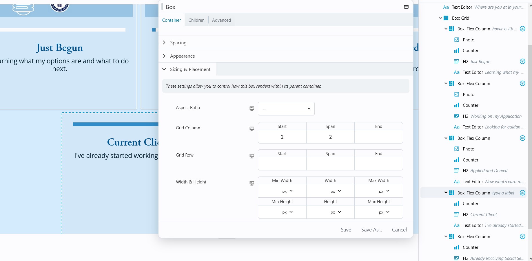
I’m going to attach a screenshot of how I’ve sized the box for the column item itself. I haven’t added sizes for each of the screen sized areas: (Large, medium, small), only the Extra Large desktop view. Is this part of the issue or am I doing too much overall for this layout?
Hey Trent! Good attempt, but I think you can scale it back a bit. If you just do 1 Box Grid to rule them all (your Flex Columns) then the Grid will keep them contained and you don’t have to worry about overflowing.
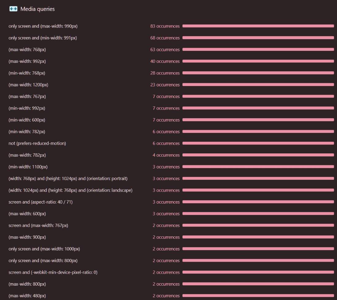
Side Note: Your breakpoints are odd. These might be the BB default, IDK WTH…., so don’t feel bad. Your have XL screens 1201px +, Large is 993px-1200px, MD/Tablet 769px-992px (1px larger than an iPad), then Small is iPad 768px and below. I recommend XL - 1440px+, Large 1081px - 1439px, Medium 1080px down to 768px (iPad) or 1px below (767px), and Small 766-767px. Also note, you probably have breakpoints in your theme, and then again in BB’s Global settings. And maybe somewhere else. A lot of conflicting ones in the 900px area (rarely a device width) but you’re going to have some craziness there. Here’s about 1/2 of your media queries - the ones below only have 1-2 instances.
Trying to do a full width row of Flex Columns is a headache you don’t need. I’d change that Row to Full Width, Content Width: Fixed., even if it’s huge, like 1920px - just to have some control. I’d do 1280px or less personally.
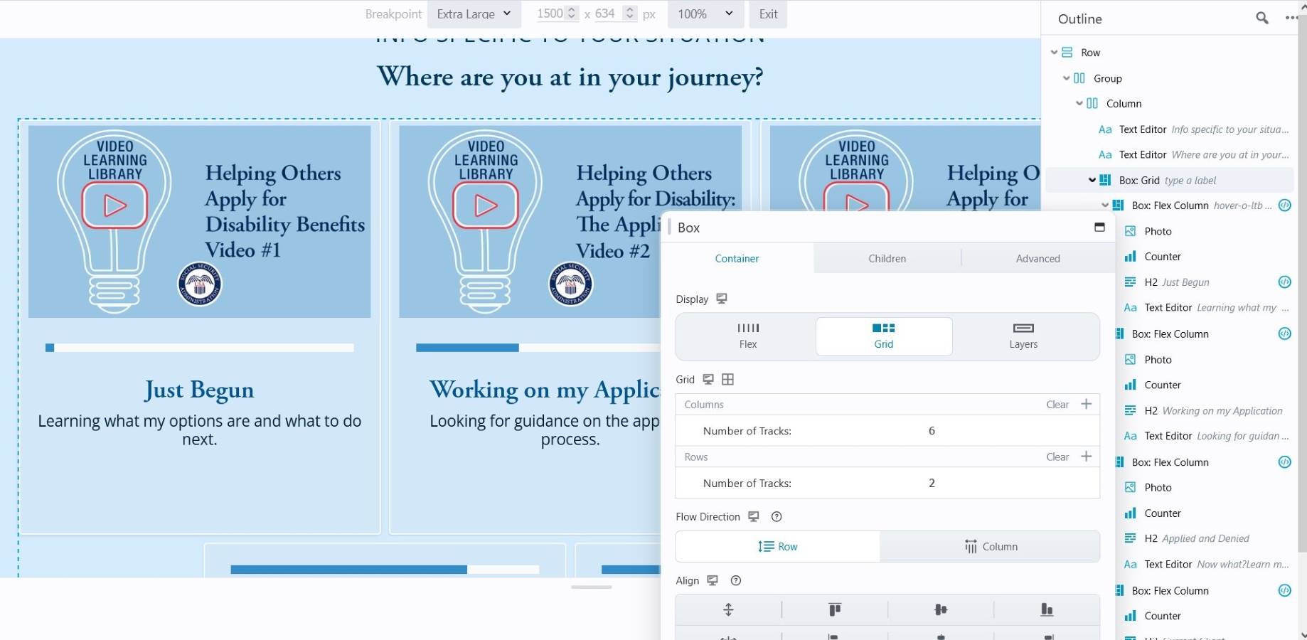
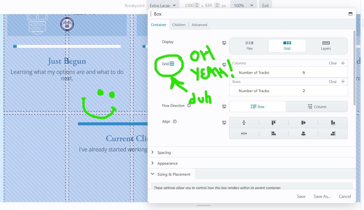
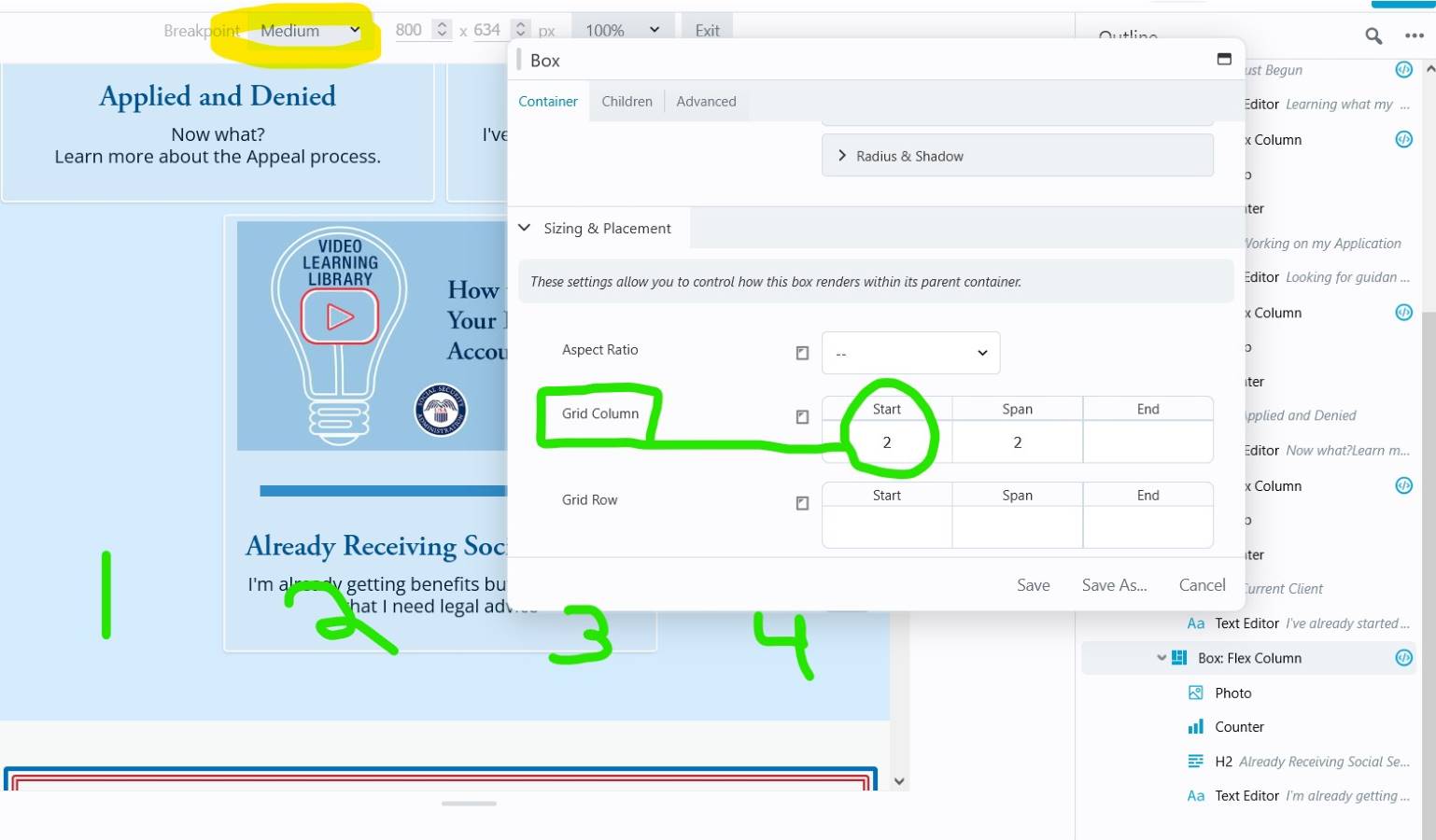
Set the main container Box as a Grid. The # of Columns and Rows depends. In my example, I had 5 content blocks and wanted 3 across and 2 on the 2nd row. How? Set Grid Columns to 2x the # of blocks you want in the row. So for my 3 blocks I needed 6 columns…
4. To center the stragglers on the bottom row, set the first Flex Column - Sizing & Placement to Start on Column 2 and Span 2. The Span 2 might be redundant. But the Start Column is the key to push the stragglers over.
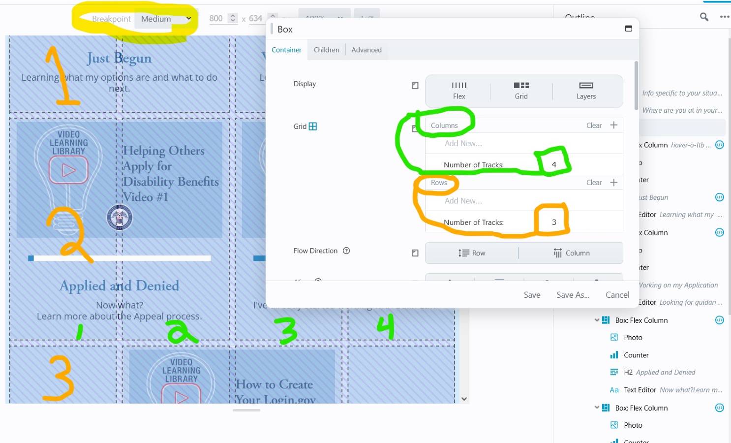
5. Keyboard shortcut “R” to cycle down to the Medium breakpoint. Adjust as needed. Here I changed the container Grid to 4 Columns and 3 Rows because I still had a straggler.
6. Change Flex Columns’ offset if you have a bottom straggler. If you had a different Flex Column offset on Large-XL screens, you’ll probably need to go change the Start Column on that one too.
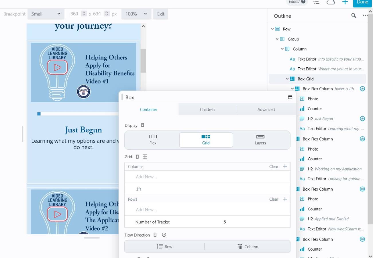
7. Shortcut “R” to Small breakpoint. Change Grid as needed. For mine, I just needed 1 column now. Probably need to change Children to Span 1. Probably need to go change prior straggler Flex Columns to Start and Span 1 Column.