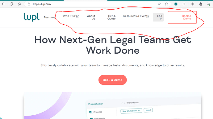
When my website is viewed in certain sizes, the nav items become two lines and the responsive design goes awry. This is specifically happening when browser windows are between 1224-1277px.
How can I fix this? I have tried adjusting the padding of the Nav items but that does not seem to do anything. I have also tried putting different CSS that I have found on Google into the “Additional CSS,” but that does not change anything either.
Here is a screenshot for reference:
Hi Isabella!
This happens because you have limited horizontal space in your menu. As the browser gets narrow, it has to shift to accommodate everything.
I suggest reducing the horizontal padding of your Get A Quote button to 10px on each side. You can also save some space by changing to Resources/Events, and reducing the letter-spacing of your menu text. In your Menu module, go to the Style tab and go to Link Typography, > Font > Style & Spacing > and type -.5 in the Spacing box.
Hope this helps!
