Replace fl-builder-content-300 with your specific Part ID, try searching dev tools for the first listing of “fl-builder-content-”
5 Likes
Where do i get that “PART ID”?
1 Like
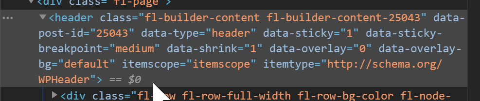
You can find the Part ID by either opening your browsers dev tools and inspecting the part element. You should see something like this:
<div class="fl-builder-content fl-builder-content-325437" data-post-id="325437" data-type="part">
  <div class="fl-row fl-row-full-width fl-row-bg-color fl-node-5cdafbc6bc60d" data-node="5cdafbc6bc60d">
The Part ID from the example above would be 325437.
Alternatively, you can go to your site’s WordPress Admin Dashboard > Beaver Builder > Themer Layouts and click on your Part layout to edit. Once on the edit screen, view the address bar and you should see something like this:
https://www.my-website.com/wp-admin/post.php?post=325437&action=edit
The numeric value in the URL is your Parts ID. 
2 Likes
This is interesting. I’m using a js driven solution that was given on the FB group. Does this simply make the existing BB header sticky on mobile, as it looks like it does?
It will work with any row, I use a Part but a Header row will work, all you need is the ID which is found as Danny explains.
That’s really neat! I’ll give it a whirl but it’s far cleaner than a js driven mobile sticky.
Thanks!
1 Like
Hi Will,
Thanks so much for this!
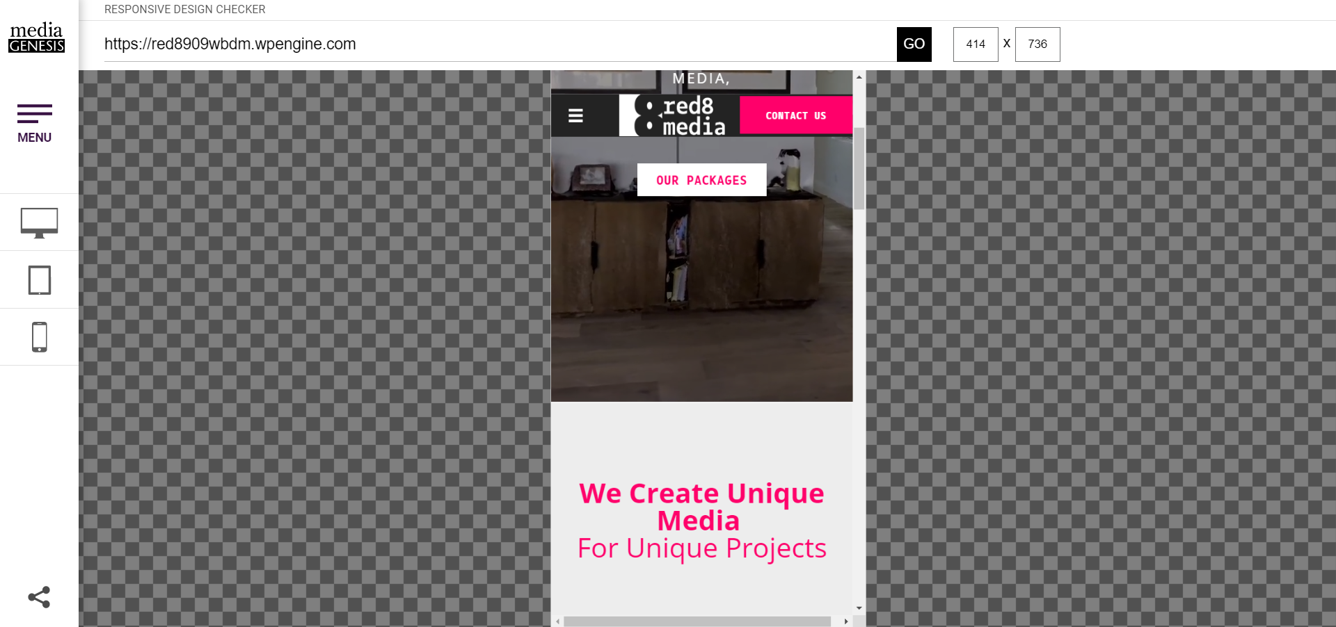
I added a separate THEMER PART for my mobile menu, but it is not working on the cell phones…
On ipads, it is sticking to the top…
On cell phones, it is scrolling with the content.
https://red8909wbdm.wpengine.com
Can you tell me what I am doing wrong?
Here is my code:
/* Allow Sticky Header */
@media (max-width:1024px) {
.fl-builder-content-164[data-type=“part”]{
z-index: 999;
min-width: 100%;
width: 100%;
position: -webkit-sticky;
position: sticky;
top: 0;
}
.admin-bar .fl-builder-content-164[data-type=“part”]{
top: 32px;
}
}
Your part is sticky for me. What device are you using?
Thanks so much!
I figured this out and got it to stick.
Jean
Hello,
everybody serach a solution to provide navigation on mobile, this solution is near this :
Anyway for me with themer and header layout, i didn’t have any result.
Dev console
Custom css (data-type=header" to match)
CSS
/* custom sticky header */
@media (max-width:1024px) {
.fl-builder-content-25043[data-type=“header”] {
z-index: 999 !important;
min-width: 100% !important;
width: 100% !important;
position: -webkit-sticky !important;
position: sticky !important;
top: 0 !important;
}
.admin-bar .fl-builder-content-25043[data-type="header"] {
top: 32px !important;
}
}
Do you have ny tips ? or u see what i miss ?
Cheers