I’ve been using BB for more than 3 years. One CONSTANT problem goes like this:
Create text box and load text into it
Add media (photo from Media Library) and position it.
Publish!
Almost ANY subsequent edit anywhere on the page and ALL the media images UNWRAP the text. (Sometimes this happens after I go into the WP editor to fix something that BB doesn’t do. NOT layout, but other back end stuff.)
Laboriously fix EVERY image position and Publish again.
What the hell is going on? Is the BB text module unable to keep images fixed in position?
I need a solution to this. It’s costing WAY too much time and effort.
Do you mean wrapping an image around text like this?
If so, can you provide a recording showing your issue. As I add made several amendments to the Text module and the text always wraps around the image regardless of how much as I have no issue adding additional text
I’ve followed your instructions but I am not able to replicate the issue. Can you disable all plugins except for Beaver Builder and see if the issue persists.
I disabled all plugins except BB and Advanced Custom Fields (required to render the pages). The phenomenon still occurs.
However, I noticed that it behaved differently depending on display size. On a 2048 X 1536px display (iPad Air2), the page appears correctly. But on 1366 X 768 (MacBook Air 11") used for the screen shots, the word wrap appears as in the error screen shots. Both are within the “Desktop” size split for responsive. Just dragging the Chrome tab from one device to the other causes the error to appear / disappear.
So there’s something about how the textbox behaves relative to display size… but I don’t know how to fix it.
I’m using a highly customized child of StudioPress’s “Agency Pro” theme. The designer who did the customization was quite a pro.
As for me… I’m eating earthworms in CSS kindergarten sandbox, so I can’t ID CSS issues. If you’re feeling charitable, I can supply the CSS for the page.
I could have a look at the page where the issue occurs if you provide the URL.
Inspecting the whole CSS file would be like looking for a needle in a haystack… no thank you!
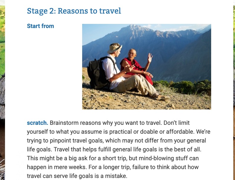
You have a non breakable space between “Start from scratch.” and “Brainstorm” preventing the text to flow normally at the left of the image on a narrow screen: the text line is too large.
Replace it with a normal space.
Not a big deal finally, you should have inspected the content before disabling all plugins or think it could be a plugin bug


